
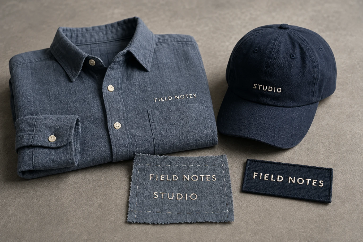
Cover image: AI-generated editorial concept; not a customer project or production proof.
To keep small embroidered lettering readable, choose a font suited to the finished letter height, preserve space inside and between characters, and check a sew-out on the intended material. If essential wording remains unclear, enlarge it, simplify the layout or reconsider the decoration method before production.
This applies to names on shirts, cap lettering, jacket logos and custom patches. Thread has physical thickness, so a sharp artwork preview alone cannot establish how tiny text will look when stitched.
Start with the finished letter height
There is no universal minimum that works across every font, thread and fabric. Follow the selected embroidery font’s recommended size range. Wilcom explains that its recommended heights refer to uppercase letters; lowercase characters can be substantially shorter and may need adjustment. Wilcom’s embroidery font guidance
Treat a proposed capital height of 4–5 mm as a size to assess, not a promise of clean results. Ask for the actual height of the smallest characters, including lowercase letters, punctuation and accents. A font’s point size is not a substitute for those finished measurements.
Specify the overall embroidery width and height as well. For projects shared across the US, Canada and UK, explicit units help: 5 mm is approximately 0.197 inches. Keep measurements consistent between the artwork, quotation and approval.
Print the layout at its intended dimensions with “fit to page” disabled, then measure the print. This helps assess proportions and reading distance, although paper cannot reproduce the stitched surface.
Give the letters room to read
Start by comparing a simple typeface with open letter shapes. Inspect the actual wording rather than approving an alphabet sample alone.
Look at the enclosed spaces, or counters, in letters such as a, e, B and g. Check whether rn could read as m, and whether dots and accents remain distinct. On curved lettering, inspect spacing at both ends of the line.
Where the design owner permits changes, compare a slightly taller letter, more spacing or simpler shapes. Increasing stroke weight deserves care: it also reduces the space left inside a fixed outline. Review weight and counters together rather than automatically making every letter bolder.
Readability problem | Revision to compare |
|---|---|
The wording feels crowded | Enlarge the text area or shorten optional wording. |
Spaces inside letters close up | Open the counters and reconsider stroke weight. |
Adjacent letters merge visually | Increase spacing and recheck the full line width. |
Decorative details dominate | Remove optional outlines, shadows or flourishes. |
Curved text crowds at the ends | Try a gentler curve or a straight line. |
Text blends into its background | Compare a clearer color contrast using physical references. |
Get approval before changing required wording or modifying a protected logo. State which constraints are fixed: the wording, letter shapes, placement or overall dimensions.
Match stitch construction to the size
Satin lettering is not the only option. Wilcom identifies run-stitch fonts for small lettering where satin columns are unsuitable, including applications below 5 mm. It also provides specialized small fonts with satin columns and push-and-pull adjustments. These are font categories, not a guarantee that every word will work at those sizes. Wilcom’s standard font documentation
Ask the digitizer to compare a suitable small-letter font or run-stitch construction when the proposed satin lettering cannot retain its shape. Review the changed appearance with the design owner before accepting the alternative.
Keep the production review specific to the design. Ask how stitch spacing, underlay, compensation and connections between letters will be handled, rather than prescribing settings copied from an unrelated file.
Consider thread and fabric together
Finer thread can expand the available options. Madeira discusses No. 60 thread for small lettering and explains that thread choice requires compatible needle selection and correctly programmed designs. Switching thread therefore calls for a coordinated production review. Madeira’s embroidery FAQs
The material matters too. Madeira describes backing as a way to stabilize the embroidery area and topping film as a way to prevent stitches sinking into looped or piled textiles. A successful sample on smooth fabric should not be treated as proof of the same appearance on a towel or textured garment. Madeira’s backing and film guidance
Tell the digitizer whether the lettering will go on a polo, cap, jacket, towel or patch. When legibility is critical, request a representative sew-out using the intended material and production setup, and confirm sample availability and any cost.
Apply the same checks to custom patches
For a patch, show the finished border on the proof. Overall patch dimensions do not describe all the space available for lettering.
Give essential wording priority over an optional slogan or illustration. Compare a larger patch, a smaller motif or fewer optional words before forcing the text into a smaller area. If the border and wording are fixed, discuss whether another construction would suit the design.
DigitEMB’s custom patch service lists embroidered, woven and printed options. Ask for a comparison at your actual dimensions; changing construction does not automatically make very small words comfortable to read.
For broader decisions about artwork detail and edges, see designing artwork that works as a patch.
Check the smallest line before approval
A digital proof helps confirm wording, dimensions and placement. Establish whether you are reviewing an artwork layout, a stitch simulation or a photograph of a physical sample; each provides different evidence.
For a representative sew-out:
Ask someone unfamiliar with the wording to read it without seeing the artwork first.
Check it at the intended viewing distance in ordinary lighting.
Inspect counters, neighboring strokes, dots and accents up close.
Check the space around the lettering, including any patch border.
Record the approved wording, dimensions, materials, color references and revision together.
If reviewing photographs, request an overall view and a close-up with a reliable size reference. An enlarged image can make tiny text seem easier to read than it is in use.
When lettering remains ambiguous, request a revision. Essential wording may require a larger design or a different decoration method. Agree on the compromise before production rather than accepting unreadable text.
Send a useful digitizing brief
For an enquiry through DigitEMB’s embroidery digitizing service, include the original artwork, exact wording, finished dimensions with units, intended item and fabric, and the smallest proposed letter height. Identify details that must remain unchanged and changes you can consider.
For variable names or phrases, provide the complete list and request checks of the longest wording and difficult character combinations. Include your intended reading distance and whether you need a representative sew-out before approval.
Frequently asked questions
Is 4 mm lettering always readable?
No. Letter height alone does not establish suitability. Check the chosen embroidery font’s size range, the smallest actual characters and a representative stitched result.
Should tiny lettering use run stitches?
A suitable run-stitch font is an option when satin construction is unsuitable. Compare its appearance and readability at the finished size before approving the change.
Will a vector file solve small-text problems?
A vector file describes the intended shapes clearly, but it cannot establish whether they will remain readable in thread. Finished dimensions and a sew-out still matter.
Should all small lettering be uppercase?
Compare the actual wording if changes are allowed. Lowercase characters may be shorter within the same font setting, but uppercase lettering still needs adequate spacing and a suitable finished size.
Practical details for Digitizing Small Lettering Without Losing Legibility
Use the article above as a starting point, then make the production brief specific to your own design. A stitch file is made for a finished size and material, so the artwork alone is only part of the instruction.
Work through these points in order and keep the answers with the artwork or production request. A short written brief makes it easier to compare a proof with the intended result, ask a useful follow-up question and avoid relying on assumptions made from a screen image alone.
The aim is not to add unnecessary steps. It is to identify the choices that change the final result before work begins. If a requirement is unknown, flag it for confirmation rather than guessing; that keeps the approval process focused on the design, material and use that apply to this particular project. Save the approved brief with the project files for future reorders or revisions.
Confirm the finished use
State the item, placement and finished width and height. A chest logo, cap front and jacket back do not use the same sewing area, even when they start from the same artwork.
Protect the smallest details
Review small lettering, narrow gaps, thin outlines and tiny colour changes at the final size. Simplifying a fragile detail before digitizing is often more reliable than trying to force it into a small sew-out.
Match the file to the machine
Tell the production team the embroidery machine or format required, along with the fabric or garment type. This lets them prepare the right export and make choices that suit the material rather than treating every job alike.
Quick questions to check before you proceed
What should I send with my artwork?
Send the clearest original available, the finished dimensions, placement, fabric or garment type and the required machine format if you know it.
Can the same file be used at every size?
Not always. Scaling changes the relationship between stitch length, detail and fabric, so a design may need review when the finished size or placement changes.
What should I check before production?
Confirm the spelling, colours, final size, placement and any details that must remain readable. A proof or sample is the best point to catch a change.