
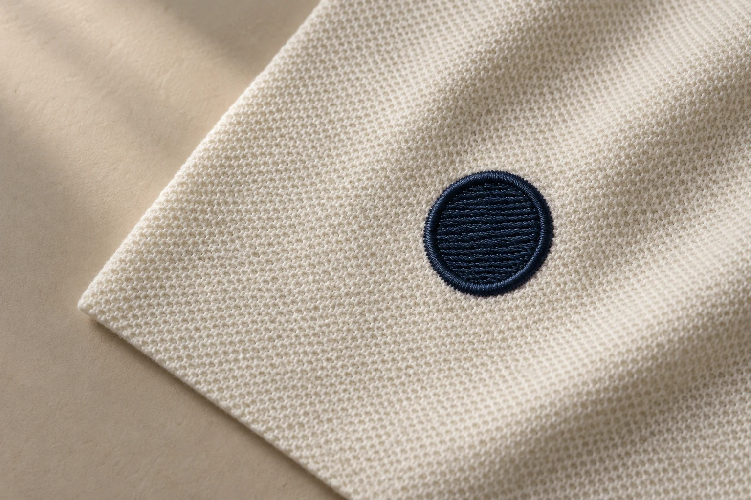
Cover image: AI-generated editorial concept; not a customer project or production proof.
Push and pull compensation adjusts an embroidery design to account for shape changes during sewing. For buyers, the practical result to check is whether the stitched shapes, lettering and borders match the intended appearance on the chosen garment. A screen preview alone cannot settle that question.
Thread tension can distort shapes and affect registration—the alignment between embroidered elements. A circle drawn perfectly round may sew into an oval. Wilcom’s embroidery glossary describes this interaction between thread and fabric.
What push and pull mean for your design
Pull draws fabric inward where the needle penetrates. A satin column can finish narrower than intended, or adjoining areas can leave a visible gap. Digitizers allow for this by extending stitches beyond selected edges or planning controlled overlap between objects. Wilcom’s fabric-stretch guidance explains these adjustments.
Push can make the ends of a stitched column extend beyond their intended position. Compensation may involve drawing those ends back. For example, Melco describes a lettering compensation feature that retracts the ends of multi-stitch-line elements to account for stitch push. Melco DesignShop user manual
These adjustments explain why a digitized shape may differ slightly from the original artwork on screen. The important comparison is between the intended design and the finished embroidery.
Why the garment belongs in the brief
A file prepared for a firm canvas tote needs review before being reused on a stretchy performance tee. The artwork may stay the same, but the fabric and its support change the sewing conditions.
Compensation works alongside stitch spacing and underlay, the supporting stitches beneath the visible embroidery. Appropriate settings depend on the fabric, object shape, column width and hooping method; backing and topping also matter. Wilcom’s compensation guidance treats these as related decisions.
Tell the digitizer which garment will be used, its fabric composition and construction if known, and the embroidery placement. If the same design is intended for polos, jackets and totes, identify each application before files are prepared.
For orders across the US, Canada and UK, label finished dimensions clearly in inches or millimetres. Include the garment style reference where available so the production team can identify the actual item.
What a useful sample review looks like
Arrange a sew-out at the intended size using the planned garment or representative fabric and production setup. Agree with the embroiderer who will make the sample and who will review any revisions.
Use the following observations to describe the result. They are review prompts, not diagnoses by themselves.
What to inspect | What to report |
|---|---|
Circles and other recognizable shapes | Whether they look stretched, narrowed or uneven against the artwork. |
Satin borders and letter strokes | Where widths appear inconsistent or ends extend too far. |
Adjacent stitched areas | The precise location of any unintended exposed fabric. |
Outlines around fills | Which edge fails to align with the filled shape. |
Spaces inside and between letters | Whether the intended openings remain readable. |
Fabric around the embroidery | Any visible gathering or rippling after removal from the hoop. |
Send an overall photograph and close-ups of the affected areas, along with the file version, finished dimensions, fabric and backing used. Describe the visible issue—for example, “a gap along the right edge”—so the digitizer can investigate it in context.
After a revision, compare another sample under the same conditions. Keep the approved file version and sample record together to make the production handoff clear.
What to ask when a sample needs correction
Ask whether the affected shape needs a compensation adjustment, a change to its outline or overlap, or a review of the supporting stitch settings. Avoid requesting more compensation everywhere simply because one edge has a gap.
Puckering also deserves a broader review. Wilcom identifies several possible causes, including density, hooping, backing, tension and needle condition. Compensation is one part of that investigation. Wilcom’s glossary entry on puckering
A useful revision request includes what looks wrong, where it occurs and the setup used. Ask the production team to explain any proposed change that alters the visible artwork, such as thicker lettering or smaller openings.
Brief questions buyers ask
Is there one correct compensation value?
No. Values depend on the design and sewing conditions. Software guidelines are starting points; they do not establish that a particular garment and design combination will sew correctly. Wilcom’s indicative settings and qualifications
Should I reject a preview because shapes overlap slightly?
Ask why the overlap is present. It may be an intentional allowance for pull. Judge the intended visible relationship in a stitched sample, while still checking the preview for wording, layout and dimensions.
Can I reuse an approved file on a different garment?
Have it reviewed and sample it on the new item. Approval on a canvas tote does not demonstrate the result on a performance tee, even at the same embroidery size.
Send the garment details with the artwork
Include the finished size, garment and fabric, placement, required machine format, and any previous sample photographs when discussing the work through DigitEMB’s embroidery digitizing service page. Agree on the sample and revision process before the main run begins.
Practical details for Push and Pull Compensation: What Buyers Should Check
Use the article above as a starting point, then make the production brief specific to your own design. A stitch file is made for a finished size and material, so the artwork alone is only part of the instruction.
Work through these points in order and keep the answers with the artwork or production request. A short written brief makes it easier to compare a proof with the intended result, ask a useful follow-up question and avoid relying on assumptions made from a screen image alone.
The aim is not to add unnecessary steps. It is to identify the choices that change the final result before work begins. If a requirement is unknown, flag it for confirmation rather than guessing; that keeps the approval process focused on the design, material and use that apply to this particular project. Save the approved brief with the project files for future reorders or revisions.
Confirm the finished use
State the item, placement and finished width and height. A chest logo, cap front and jacket back do not use the same sewing area, even when they start from the same artwork.
Protect the smallest details
Review small lettering, narrow gaps, thin outlines and tiny colour changes at the final size. Simplifying a fragile detail before digitizing is often more reliable than trying to force it into a small sew-out.
Match the file to the machine
Tell the production team the embroidery machine or format required, along with the fabric or garment type. This lets them prepare the right export and make choices that suit the material rather than treating every job alike.
Quick questions to check before you proceed
What should I send with my artwork?
Send the clearest original available, the finished dimensions, placement, fabric or garment type and the required machine format if you know it.
Can the same file be used at every size?
Not always. Scaling changes the relationship between stitch length, detail and fabric, so a design may need review when the finished size or placement changes.
What should I check before production?
Confirm the spelling, colours, final size, placement and any details that must remain readable. A proof or sample is the best point to catch a change.