
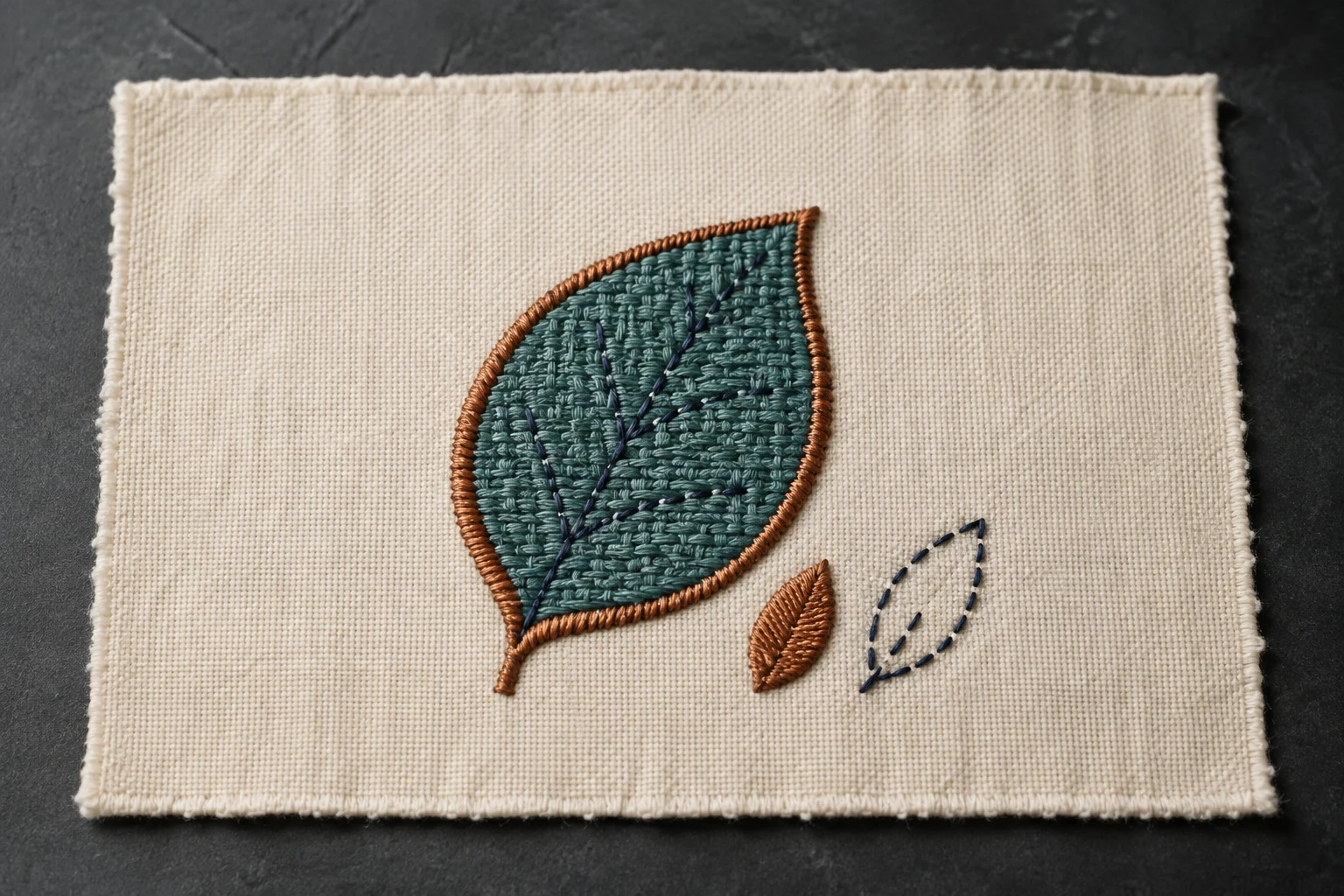
Cover image: AI-generated editorial concept; not a customer project or production proof.
Use satin stitch for narrow, glossy shapes, fill stitch for broad areas and running stitch for fine lines and outlines. Choose for each part of the design at its finished embroidery size; one logo can use all three.
Which stitch fits each shape?
Design element | Practical starting choice |
|---|---|
Fine outline or line drawing | Running stitch follows a single path. |
Narrow border or lettering stroke | Satin spans the column to create a smooth, glossy surface. |
Broad solid shape or background | Tatami fill covers the area with rows of shorter stitches. |
These are starting points rather than fixed rules. Hatch’s stitch glossary explains the basic structures and their uses.
Running stitch: fine lines and detail
Running stitch places consecutive stitches along a line, much like a pencil tracing a path. It suits delicate outlines and linear details. Stitch length can vary to follow tight curves more closely. See the Hatch definition of running stitch.
Small lettering needs more judgment. A purpose-designed running-stitch font can work where a satin column is unsuitable, but changing every tiny letter to a running outline is not a universal fix. Hatch provides both running-stitch fonts and small satin fonts, each with recommended size limits. Follow the selected font’s guidance and check the actual sewn result. Hatch’s font guide explains these distinctions.
Satin stitch: smooth borders and lettering
Satin stitches cross a narrow shape from side to side. With few intermediate needle penetrations interrupting the surface, they produce the familiar glossy appearance used for borders, script lettering and other column-shaped details.
Pay attention to the width of the individual stroke, not just the overall size of the logo or letter. A large letter with narrow strokes may still suit satin; a smaller solid shape may need fill.
There is no universal half-inch satin limit. Machines have maximum stitch lengths, and software can split long satin stitches into shorter segments. Those extra penetrations change the surface appearance. For broad areas, consider tatami fill or divide the artwork into suitable sections. Wilcom’s satin documentation explains narrow-column applications and automatic splitting.
Fill stitch: coverage for larger areas
In this comparison, “fill” means tatami fill: rows of running stitches covering a shape. It is useful for large or irregular areas that would require long stitches if sewn entirely in satin. Wilcom’s tatami guide describes these applications.
Stitch direction and pattern affect the texture. However, fill does not automatically mean a low stitch count. Enlarging a filled design can increase its stitch count substantially, so a jacket-back version deserves a fresh review even if a smaller chest version worked well. Wilcom’s scaling examples show why embroidery does not scale like a printed image.
Choose at the size and on the fabric you will use
Start with the finished dimensions. For buyers and decorators working across the US, Canada and UK, specify units clearly—for example, 3 inches wide (76.2 mm)—and identify the garment, fabric and placement.
Then assess each element separately. An illustrative leaf design might use tatami for its broad body, satin for a substantial border and running stitch for fine veins. This gives each part a stitch structure suited to its shape.
Fabric also affects the settings. Stitch spacing may need to change between fabrics and objects, while crowded stitches around tight curves can cause thread breaks. Choosing a stitch type is therefore only part of preparing the design. Wilcom’s stitch-spacing guidance explains these relationships.
Before a production order, ask your embroiderer to sew a sample at the intended size on matching material. Inspect the lettering, edge alignment, coverage and feel. If you need help preparing the file, explore DigitEMB’s embroidery digitizing service and provide the artwork, finished dimensions, garment details and required machine format.
Frequently asked questions
Can one logo combine satin, fill and running stitches?
Yes. Choose stitch types by element: satin for narrow columns, tatami for broad shapes and running stitch for fine paths. The whole design does not need one stitch type.
Is running stitch always best for very small text?
No. Some small lettering uses specially digitized satin columns; other lettering uses running-stitch fonts. Use the font’s recommended size range and confirm legibility in a sewn sample.
Should wide satin always become fill?
Tatami is a useful starting choice for broad coverage, but splitting satin or dividing a shape may also be appropriate. Review the desired finish, machine limits and sample before deciding.
Practical details for Choosing the Right Stitch Type: Satin, Fill and Run
Use the article above as a starting point, then make the production brief specific to your own design. A stitch file is made for a finished size and material, so the artwork alone is only part of the instruction.
Work through these points in order and keep the answers with the artwork or production request. A short written brief makes it easier to compare a proof with the intended result, ask a useful follow-up question and avoid relying on assumptions made from a screen image alone.
The aim is not to add unnecessary steps. It is to identify the choices that change the final result before work begins. If a requirement is unknown, flag it for confirmation rather than guessing; that keeps the approval process focused on the design, material and use that apply to this particular project. Save the approved brief with the project files for future reorders or revisions.
Confirm the finished use
State the item, placement and finished width and height. A chest logo, cap front and jacket back do not use the same sewing area, even when they start from the same artwork.
Protect the smallest details
Review small lettering, narrow gaps, thin outlines and tiny colour changes at the final size. Simplifying a fragile detail before digitizing is often more reliable than trying to force it into a small sew-out.
Match the file to the machine
Tell the production team the embroidery machine or format required, along with the fabric or garment type. This lets them prepare the right export and make choices that suit the material rather than treating every job alike.
Quick questions to check before you proceed
What should I send with my artwork?
Send the clearest original available, the finished dimensions, placement, fabric or garment type and the required machine format if you know it.
Can the same file be used at every size?
Not always. Scaling changes the relationship between stitch length, detail and fabric, so a design may need review when the finished size or placement changes.
What should I check before production?
Confirm the spelling, colours, final size, placement and any details that must remain readable. A proof or sample is the best point to catch a change.