
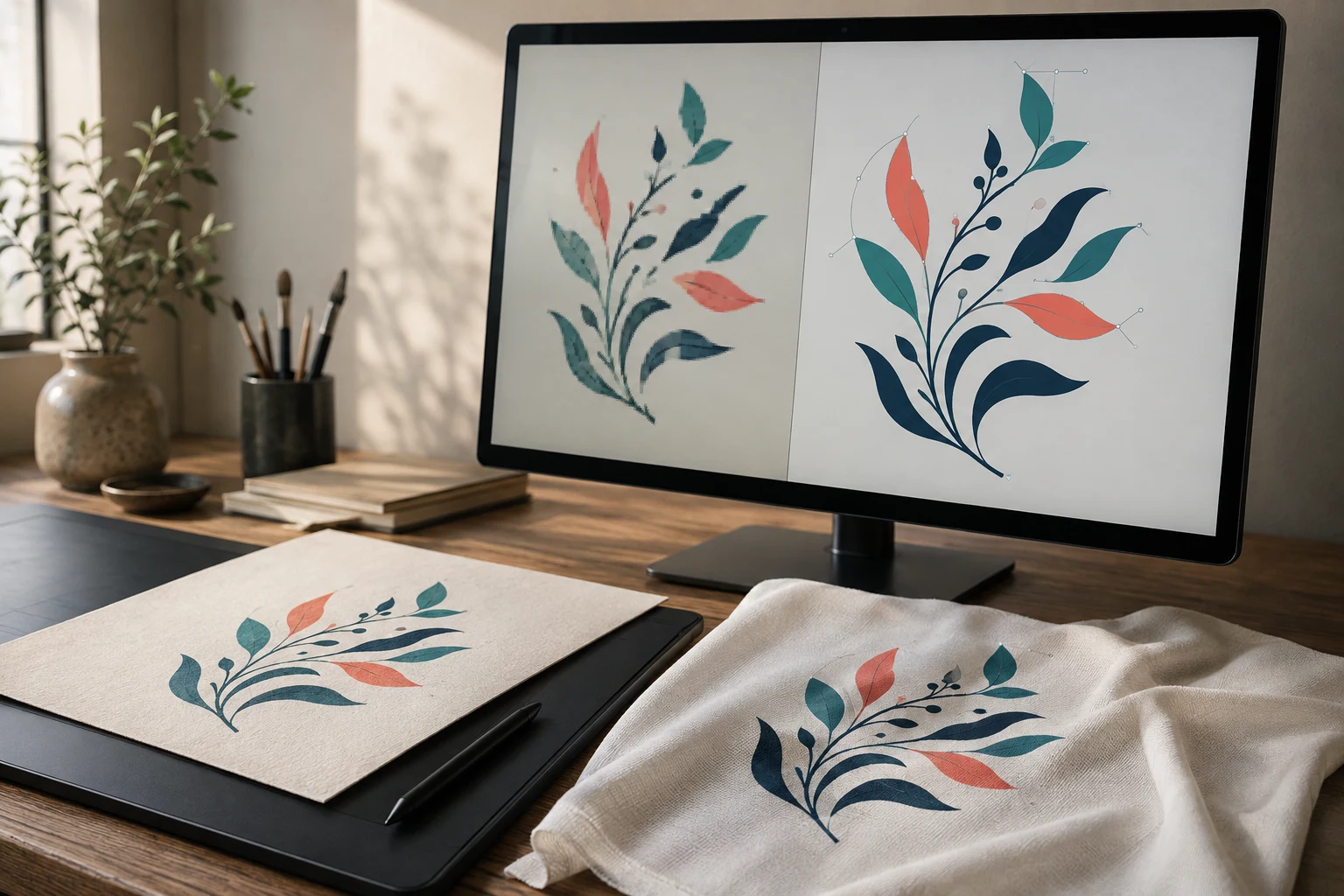
Cover image: AI-generated editorial concept; not a customer project or production proof.
To turn a raster image into vector artwork with Illustrator’s Pen tool, place the image on a locked reference layer, draw paths over its shapes, refine the anchor points, apply colors and save an editable vector master. Clicking creates straight segments; dragging creates curves. You are rebuilding the artwork as paths rather than changing the original pixels. Adobe’s Pen tool guide
This method is useful for logos, lettering and illustrations that need clean outlines at different sizes. For sublimation, however, vector conversion is optional: photographs usually belong in a raster workflow.
When should you convert artwork for sublimation?
Raster images contain pixels; vector graphics describe shapes with mathematical paths. Vector paths can be resized without the pixelation caused by enlarging a small raster image. Photographs and textured artwork still benefit from raster formats because they preserve continuous tonal detail. Adobe’s raster and vector overview
Artwork or requirement | Practical choice |
|---|---|
Flat logo needed at several sizes | Rebuild it as editable vector paths. |
Photograph or detailed painted image | Retain raster artwork with sufficient resolution at the intended print size. |
Simple illustration with uneven edges | Manually trace the intended contours and refine them. |
Blurry lettering with unclear shapes | Request better source artwork before guessing missing details. |
Sublimation uses heat to transfer dye into compatible materials, including polyester fabric and specially coated products such as mugs and metal panels. Converting the artwork does not make an unsuitable blank compatible with the process. Sawgrass’s sublimation overview
Trace a raster image in seven steps
1. Place and secure the reference image
Create an Illustrator document, then use File > Place to insert your JPEG or PNG. Open the Layers panel, lock the layer containing the reference and create another layer above it for tracing. This keeps the image from moving while you work. Adobe demonstrates this reference-and-drawing-layer setup in its logo design tutorial.
Start with the clearest available source. Before drawing, identify the main shapes, separate color areas and details that must remain recognizable at the final size.
2. Draw the straight sections
Select the Pen tool (P). Use no fill and a visible stroke while tracing so the reference remains visible beneath the path.
Click at the start of a straight edge, then click at its end. Continue around corners. Place points where the outline changes direction rather than following every pixel irregularity. Adobe explains straight segments and path closure in its Pen tool drawing instructions.
3. Build curves and close each shape
Click and drag when placing an anchor on a curved section. The direction handles control how the curve enters and leaves that point. Aim for a few deliberate anchors rather than many short segments.
To move from a curve into a straight segment, click the last anchor with the Pen tool to remove its outgoing direction handle. Click the starting anchor when you finish an enclosed shape. Press Esc to finish an open path. Adobe’s introductory Pen tool lesson
Trace separate artwork elements as separate objects. For example, draw each petal of a simple flower independently so you can adjust its outline and color without rebuilding the whole design.
4. Refine anchors and handles
Choose the Direct Selection tool (A) and select an individual anchor or segment. Move misplaced anchors and adjust handles until the contour follows the intended shape. This tool edits parts of a path; it is not a shape-combining tool. Adobe’s Direct Selection instructions
Check both close up and at the intended output size. A contour can look smooth under heavy magnification while the overall shape still feels unbalanced.
5. Apply fills and strokes
Apply the intended fill colors through the Color or Swatches panel. Remove temporary tracing strokes unless they belong in the finished artwork. Keep separate color areas organized so later revisions remain straightforward. Adobe’s logo design tutorial covers applying color and organizing artwork.
For buyer-supplied artwork, request the intended color references rather than treating colors sampled from a compressed screenshot as definitive.
6. Inspect the vector without the reference
Hide the raster layer and examine the drawing on its own. Look for missing elements, uneven curves, accidental overlaps and shapes that were left open.
Remove unnecessary anchors carefully, checking the contour after each change. Adobe demonstrates point removal and path adjustment in its path editing lesson.
Make a working copy before cleanup. Compare the finished drawing against the reference for proportions and spacing, especially around lettering and small details.
7. Save the master and prepare the delivery file
Save an AI master that retains editable artwork. Create the delivery copy in the format requested by the printer or buyer. Illustrator supports formats including PDF, SVG and EPS, but exporting to JPEG or PNG produces raster output. Adobe recommends retaining AI while creating artwork and exporting afterward as needed. Adobe’s saving guide
Remove the reference image from a delivery copy intended to contain only vector artwork. Reopen that copy to confirm the design is complete. Saving an untouched JPEG inside an AI file does not turn its pixels into vector paths.
Prepare the artwork for sublimation
Confirm the color workflow before converting to CMYK. There is no universal CMYK requirement for sublimation. For example, Sawgrass’s documented Photoshop-to-Print-Utility workflow on macOS uses RGB artwork. That example demonstrates why settings must follow the actual printer software; it is not an Illustrator preset to copy blindly. Sawgrass’s color setup instructions
When supplying artwork to a printer in the US, Canada or UK, provide:
The finished width and height, with units explicitly stated in inches or millimeters.
The product and printable area, including any supplier template.
The requested file format, color profile and background treatment.
A preview showing the intended appearance and any critical details.
Ask who will handle mirroring and final print placement. Keep small text and fine details only when they remain legible at the intended size; there is no need to simplify every sublimation design automatically.
For production approval, request a test transfer on a representative blank. A paper print alone cannot establish how the finished transferred image will look. Use the blank and equipment suppliers’ instructions for pressing settings.
If you need help rebuilding the artwork, explore DigitEMB’s raster-to-vector services. Supply the clearest source image, target dimensions and your printer’s requirements so the requested deliverable is explicit.
Frequently asked questions
Does every sublimation image need to be vector?
No. Vector paths are useful for scalable logos and illustrations. Photographs can remain raster images; their suitability depends on resolution at the final print size and the printer’s requirements.
Why does my traced curve look lumpy?
Check for too many anchors, misplaced points or handles that change direction abruptly. Adjust the existing handles first, then remove unnecessary points while watching the contour.
Is saving a PNG as SVG enough to vectorize it?
No. A vector-capable file can still contain an embedded raster image. The artwork must be rebuilt as paths to gain editable vector contours.
Should I always deliver EPS?
No. Retain an editable AI master and ask which delivery format the recipient supports. Use EPS when specifically required, rather than assuming it is the default for every printing workflow.
Practical details for How to Turn a Raster Image Into Vector With the Pen Tool
Vector artwork is built from editable paths rather than a fixed grid of pixels. The clearest result starts with a specific intended use, because a file prepared for print, cutting and embroidery may need different checks.
Work through these points in order and keep the answers with the artwork or production request. A short written brief makes it easier to compare a proof with the intended result, ask a useful follow-up question and avoid relying on assumptions made from a screen image alone.
The aim is not to add unnecessary steps. It is to identify the choices that change the final result before work begins. If a requirement is unknown, flag it for confirmation rather than guessing; that keeps the approval process focused on the design, material and use that apply to this particular project. Save the approved brief with the project files for future reorders or revisions.
Start with the best source
Provide the largest, clearest original you have and include any brand colours, fonts or reference files. A small or blurry image can still be traced, but missing edges and lettering need careful confirmation.
Define the final use
Say whether the artwork is for print, cutting, screen printing, embroidery reference or a digital asset. This tells the artist which details, colour separations and file formats matter most.
Review paths, text and colour
Before using the finished file, check that lettering is correct, shapes are closed where required and colours match the approved artwork. Keep a master editable file as well as the delivery format used by production.
Quick questions to check before you proceed
Is a vector file the same as an embroidery file?
No. A vector is editable artwork; an embroidery file contains stitch instructions. Vector art can be useful source material for digitizing, but it still needs to be digitized for machine embroidery.
Can a blurry logo be converted?
Often, yes, but the result depends on what can be verified. Supply a clearer reference, font name or brand guide whenever possible.
Which details need approval?
Check spelling, line weight, enclosed spaces, colour choices and the shape of any logo elements before the file goes to print or production.