
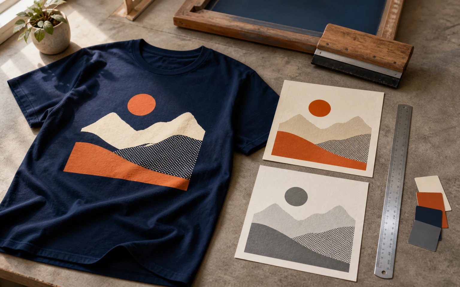
Cover image: AI-generated editorial concept; not a customer project or production proof.
To prepare artwork for screen printing, confirm the finished print size and material, supply the best original artwork, preserve editable layers, resolve fonts and linked images, and agree on the ink and separation requirements with your printer. Review the exported file and proof before approving production.
These steps apply to logos, lettering, illustrations and photographic designs. The right preparation depends on the artwork and the product being printed; a shirt graphic and a trimmed poster do not need identical files.
1. Define the product, placement and finished size
Get the printer’s artwork requirements before changing the design. Include the garment style, fabric composition and color, or identify the paper or other material for a non-garment job.
State the print location and dimensions with units. For suppliers in the US, Canada and UK, an instruction such as “10 inches wide (254 mm), height proportional” avoids ambiguity. This is an example specification, not a recommended size for every garment.
List each required size and color variation separately. A chest print and a back print may share a master design but need different detail adjustments. Ask for the product template and confirm the usable print area before positioning artwork near seams, pockets or edges.
2. Choose suitable vector or raster artwork
Editable vector paths are useful for lettering, logos and solid shapes because they can be resized without pixel-resolution loss. Raster artwork can suit photographs, painted illustrations and textured designs. Both can be used for screen printing when prepared for the chosen process. PRINTING United Alliance’s artwork guide
Send the original design file when available and ask which delivery format the printer accepts. A filename alone does not establish whether the contents are suitable.
Artwork supplied | What to check |
|---|---|
Vector design | Confirm that the important shapes are editable paths and that any placed images are also supplied. |
Raster image | Check its pixel dimensions, clarity and resolution at the final print size. |
PDF or EPS | Inspect the contents; these files can contain raster artwork as well as vector shapes. |
Small web image | Treat it as a reference and ask whether a better original or redraw is needed. |
For a logo redraw, compare the result with the approved reference. Check proportions, letter shapes and spacing, and identify anything too unclear to reconstruct confidently. Keep the approved master separate from versions simplified for a particular print size.
3. Check resolution at the actual output size
PPI means pixels per inch and describes image resolution at a given printed size. DPI describes output-device dots per inch. Neither number alone establishes whether a design will reproduce successfully.
Calculate effective PPI by dividing the image width in pixels by its printed width in inches. For example, an image 3,000 pixels wide provides 300 PPI at 10 inches wide and 150 PPI at 20 inches wide. These figures illustrate the calculation, not universal screen-printing acceptance standards. Adobe’s printed image resolution guide
Ask the printer what resolution the design needs. Changing a resolution label without adding pixels does not recover missing detail. Send the highest-quality original and inspect lettering, edges and textures at the intended size.
Vector paths do not need a PPI setting, but raster images and raster effects within a vector document still require checking.
4. Preserve layers and supply supporting files
Keep an editable master with useful layers intact. Name artwork groups clearly so the printer can identify text, backgrounds and design elements. Flattening combines content and removes the original layer structure, making later revisions less flexible. Save a separate delivery copy if the printer requests flattened artwork. Adobe’s layer-management guidance
Check placed images rather than assuming they are embedded. Resolve missing or outdated links, and include the supporting assets the printer requests. Illustrator’s packaging feature can collect the document and linked graphics for a handoff. Adobe’s file-packaging guidance
Design layers are not automatically production separations. Confirm who will prepare the individual ink outputs before treating an organized file as ready for screen making.
5. Resolve fonts and review small detail
Ask how the printer wants fonts handled. If outlined lettering is requested, keep a master with live text and outline a separate copy. Outlining converts lettering to paths and removes normal text-editing properties. Adobe’s outline-text documentation
Proofread before outlining, then compare the outlined version with the original. Check names, dates, punctuation, numbers and any regional spelling required by the design.
Review the smallest print version first. Print a paper reference at actual size with automatic page scaling disabled, then check its dimensions with a ruler. Look at thin strokes, small lettering, enclosed letter spaces and narrow unprinted gaps.
Ask the printer which details need adjustment for the proposed ink and material. Production choices vary with the garment, ink and artwork detail, as illustrated in Ryonet’s underbase guidance. A paper reference helps judge size and readability but cannot prove how ink will reproduce on fabric.
6. Agree on colors before converting the file
Do not automatically convert every design to CMYK. A spot-color job uses specified inks, while four-color process work uses cyan, magenta, yellow and black in combination. Ask the printer which color mode, profile and ink setup it expects before making conversions. Adobe’s spot and process color guidance
For color-sensitive work, provide the approved color reference and agree how the printer will assess the match. A monitor preview represents color; it is not a physical ink sample.
Make unprinted areas explicit. White in a preview might mean white ink, exposed white material or simply the document background. For an orange-and-white design on a navy shirt, identify which navy areas should remain exposed fabric.
An underbase is an ink layer beneath subsequent colors that helps their appearance on the material. Ask whether one is needed and how visible white should be handled. Do not infer the full screen count solely from the colors visible in the artwork. PRINTING United Alliance’s screen-printing guide
7. Clarify grayscale, shading and separations
Distinguish a solid black design from a photograph containing gray tones. For a shaded monochrome image, ask whether the printer wants a grayscale source or a prepared ink channel. Grayscale describes tonal information; it does not specify the complete ink setup.
Halftones use dots to reproduce shading. Gradients and photographs therefore need an agreed tonal treatment for screen printing, even when a gradient remains editable in a vector file. PRINTING United Alliance’s explanation of halftones
Confirm whether the artwork provider or printer will prepare separations, underbase adjustments, overlaps between adjacent colors and registration marks. Leave halftone settings to the production workflow unless the printer supplies explicit requirements.
Illustrator’s Separations Preview can help inspect inks and overprinting, but it does not validate trapping, printer’s marks or halftone settings. Adobe’s separation documentation
8. Use bleed and margins where the product requires them
Bleed extends artwork beyond a trim boundary so color can reach the finished edge after cutting. Use the printer’s required allowance for screen-printed posters or other trimmed products. Keep essential content inside the specified safe area. Adobe’s bleed guidance
For an ordinary print positioned within a finished T-shirt, ask for placement and printable-area limits rather than adding a generic page bleed. If the job involves printing panels before cutting or sewing, obtain the panel template and finishing allowances.
For banners or other finished fabric products, confirm any hemming or pole-pocket allowance separately. Those requirements belong to the product specification and should not be transferred to every screen-printing job.
9. Reopen the export and approve the exact version
Use the printer’s requested format and export settings. Reopen the exported file and compare it with the approved master, especially after outlining text, changing color settings or flattening content.
Before sending it:
Confirm spelling, dimensions and all approved design changes.
Check that images, fonts and intended design elements are present.
Identify ink colors and areas that remain unprinted.
Include a reference proof showing appearance and placement.
Label each size and color variation clearly.
Record who is responsible for separations and production approval.
A digital proof supports content and layout review. If color, fine detail or print feel is critical, discuss a physical sample on the intended material. Approve the exact revision and state whether approval covers artwork, sample preparation or production.
For artwork that needs rebuilding, inquire through DigitEMB’s vector art conversion service. Include the original artwork, finished dimensions, material details and printer requirements. If separations are also needed, state that explicitly and confirm the scope and output files.
Frequently asked questions
Can I send a PNG or JPEG for screen printing?
Possibly. Send the best original and have the printer review its detail at the finished size. A transparent background or a particular extension does not establish print suitability.
Is 300 PPI always required?
No single resolution suits every design and production setup. Confirm the printer’s requirement at the actual print dimensions; changing the PPI label alone does not restore detail.
Should every screen-printing file be CMYK?
No. Agree on the intended spot or process ink workflow first. A document’s color mode and conversion of spot inks to process inks are separate decisions. Adobe’s separation guidance
Does outlining text make tiny lettering printable?
No. Outlining changes how lettering is stored. Its physical size, strokes and openings still need the printer’s review.
Can one design be used for both chest and back prints?
You can start from one master, but review and approve each final size separately. Keep any simplified small-print version clearly identified.
Practical details for How to Prepare Artwork for Screen Printing: 9 Practical Steps
Vector artwork is built from editable paths rather than a fixed grid of pixels. The clearest result starts with a specific intended use, because a file prepared for print, cutting and embroidery may need different checks.
Work through these points in order and keep the answers with the artwork or production request. A short written brief makes it easier to compare a proof with the intended result, ask a useful follow-up question and avoid relying on assumptions made from a screen image alone.
The aim is not to add unnecessary steps. It is to identify the choices that change the final result before work begins. If a requirement is unknown, flag it for confirmation rather than guessing; that keeps the approval process focused on the design, material and use that apply to this particular project. Save the approved brief with the project files for future reorders or revisions.
Start with the best source
Provide the largest, clearest original you have and include any brand colours, fonts or reference files. A small or blurry image can still be traced, but missing edges and lettering need careful confirmation.
Define the final use
Say whether the artwork is for print, cutting, screen printing, embroidery reference or a digital asset. This tells the artist which details, colour separations and file formats matter most.
Review paths, text and colour
Before using the finished file, check that lettering is correct, shapes are closed where required and colours match the approved artwork. Keep a master editable file as well as the delivery format used by production.
Quick questions to check before you proceed
Is a vector file the same as an embroidery file?
No. A vector is editable artwork; an embroidery file contains stitch instructions. Vector art can be useful source material for digitizing, but it still needs to be digitized for machine embroidery.
Can a blurry logo be converted?
Often, yes, but the result depends on what can be verified. Supply a clearer reference, font name or brand guide whenever possible.
Which details need approval?
Check spelling, line weight, enclosed spaces, colour choices and the shape of any logo elements before the file goes to print or production.