
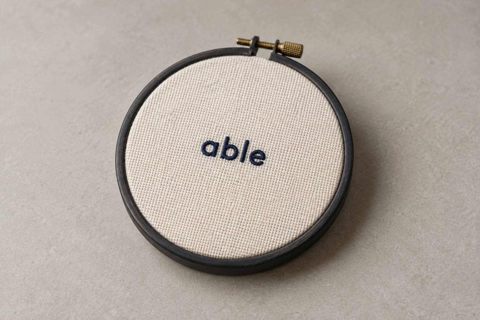
Cover image: AI-generated editorial concept; not a customer project or production proof.
To digitize small letters for machine embroidery, work at the finished size, choose a suitable small embroidery font, and inspect the generated stitches in every narrow stroke and tight curve. Adjust spacing, underlay, compensation and connections, then test the actual wording on the intended fabric. Change settings from the stitched result rather than relying on a universal minimum letter height or density.
Small text appears in uniform names, logo taglines, caps, event merchandise, personalized bags and craft projects. This workflow focuses on constructing and correcting the stitch file for that text.
1. Set the smallest characters at their finished size
Record the complete wording, overall text width, capital height, fabric and placement before generating stitches. Keep letter height separate from stroke width: a letter can be tall enough yet contain a stroke too narrow for its intended construction.
For projects shared across the US, Canada and UK, use explicit units. A proposed 5 mm capital height is approximately 0.197 inches; this is a measurement example, not a minimum-size recommendation.
Choose an embroidery alphabet with a documented size range. Wilcom identifies dedicated small fonts at 6 mm and below, including satin constructions, and run-stitch fonts for small text where satin is unsuitable. Its recommended heights refer to uppercase characters, so inspect lowercase letters separately. These categories do not establish a universal minimum. Wilcom’s font size and construction guidance.
Enter the actual wording immediately. Check lowercase a and e, the openings in B, and any dots or accents. If the font cannot preserve those details within its recommended range, compare a larger size or simpler alphabet before editing individual stitches.
2. Prepare the thread and fabric setup
Establish which thread the file will use before refining its smallest details. Madeira describes No. 60 as finer than No. 40 and discusses its use for small lettering. It also says designs must be programmed for the thread and paired with a suitable needle. A thread change therefore requires reviewing the file and machine setup together. Madeira’s thread and needle guidance.
Record the actual garment material and stabilizer. Backing supports the embroidery area; topping helps keep stitches from sinking into piled surfaces. A smooth swatch cannot establish how the same letters will appear on terry or another textured material. Madeira’s backing and topping guidance.
For a cap, use a representative cap sample when testing. For a polo or work shirt, use the intended fabric and support arrangement. Keep these conditions consistent while comparing digitizing changes.
3. Inspect the letter construction before adding density
Generate the lettering, then view its stitches with the artwork visible as a reference. For custom letterforms, build and inspect the individual strokes at the final dimensions.
Work through each problem area:
Open cramped counters—the spaces inside letters—while preserving the character’s identity.
Check narrow stems and joins for overlapping stitch layers.
Inspect the inside of curves for concentrated needle penetrations.
Review stitch angles where a straight stem becomes a rounded section.
Adjust individual letter pairs when their visible gaps become uneven.
Control points allow changes to outlines, stitch angles and entry or exit points. Stitch shortening can reduce crowding on tight turns. Inspect the generated result after using either tool. Hatch’s control-point and stitch-shortening definitions.
Start with simple block shapes when the design permits. Get the design owner’s agreement before simplifying distinctive serifs, changing capitalization or altering a wordmark.
A purpose-built run-stitch alphabet can provide an alternative appearance when satin columns are unsuitable. Compare the whole word before accepting that change; it will not reproduce the same solid stroke as satin.
4. Balance stitch spacing and underlay
Begin with the selected font’s intended settings. Check how your software expresses density: when the control is stitch spacing in millimeters, a smaller value places stitches closer together. Stitch length describes a different measurement. Hatch’s stitch terminology.
Avoid assigning every small letter a fixed density or minimum stitch length. Inspect the narrowest sections and curves, then test whether a spacing change improves coverage without adding unwanted bulk. More stitches cannot reopen a counter that the letter shape has already closed.
Choose underlay deliberately. Hatch’s lettering guidance suggests no underlay below 5 mm and center-run underlay for lettering from 6–10 mm. Treat these as starting points within that software’s guidance, alongside the font construction and fabric, rather than rules for every embroidery setup. Hatch’s lettering underlay guidance.
Check whether underlay remains inside the top stitching and whether it adds bulk at intersections. Do not automatically remove all support to fix loops, or add an edge run to every narrow stroke. Compare a controlled sample with the font’s original construction before committing to a change.
5. Correct distortion with targeted compensation
Pull compensation extends stitching beyond the object outline to counter narrowing during embroidery. It is separate from density. Wilcom explains that suitable compensation depends on factors including fabric, hooping and object size. Wilcom’s automatic pull compensation guidance.
Compare the stitched stem width with the intended shape. If a particular stem becomes too thin, review its support and compensation. Check surrounding counters and letter gaps after adding width; a correction to one stroke can crowd another.
Inspect the ends of strokes and baseline separately. Avoid increasing compensation across an entire word to correct a local distortion. Preserve a copy of the previous version so the next sew-out shows whether the change helped.
6. Plan connections, trims and sewing order
Preview the sequence with connectors visible. Follow the route into and out of each letter, especially where travel crosses an open counter or the gap between characters.
Hatch’s closest-join method connects nearby points and can reduce trims. Its “as digitized” method preserves the font’s original joining arrangement, including constructions that combine stitch types. Start with the font’s intended method and inspect any change. Hatch’s lettering join methods.
Keep these checks specific to small text:
Ensure a connection does not visually close an opening.
Inspect securing stitches at starts and stops for localized buildup.
Confirm that intended trims remain present in the exported machine file.
Review color changes and stops only where the design actually needs them.
Do not assume a short exposed connector will disappear into the fabric. Assess it on the sample before removing a trim to simplify the sequence.
7. Use a controlled sew-out to diagnose problems
Sew the complete wording at its final size using the planned fabric, backing, topping, needle and thread. Examine it after releasing it from the hoop. Read the whole word at its intended viewing distance, then inspect individual strokes closely.
Stitched result | Next comparison to make |
|---|---|
Counters close up | Compare a more open letter shape and review excess stroke width or compensation. |
Narrow sections feel bulky | Inspect overlapping layers, underlay and crowded penetrations before changing spacing. |
Stems appear too thin | Review support and targeted compensation, then sew another sample. |
Adjacent letters merge | Adjust the affected pair and recheck total word width. |
Connections remain visible | Review entry and exit points, join method and trims. |
Text sinks into texture | Review the fabric support and topping arrangement; compare a larger size if needed. |
These are diagnostic comparisons, not guaranteed fixes. Change one variable where practical and label each sample with its file revision and production setup. If a stitch-setting change does not help, reconsider the letter shape or size.
Retain the editable master and export the format required by the receiving machine. Review the export’s dimensions, sequence and machine functions before running it. Machine files contain stitch coordinates and functions, while editable design files retain information useful for revisions. Hatch’s design and machine-file definitions.
What to send for a small-lettering revision
Include the artwork, exact wording, finished dimensions, font reference, fabric, placement, thread details and required machine format. For an existing problem, send the editable file if available, the exported stitch file, and photographs of the sew-out with a size reference. Identify the specific letters that need correction.
When contacting DigitEMB’s embroidery digitizing service, state which details can change and ask how sampling and revisions will be handled. Confirm the production setup with the decorator who will run the file.
Frequently asked questions
Can I simply shrink a larger lettering file?
Treat resizing as a new review. Recheck the font’s size range, smallest strokes, underlay and connections, regenerate stitches where appropriate, and test the resized wording.
Is 4 mm always a safe letter height?
No. Suitability depends on the specific alphabet, characters, thread and fabric. Use the font’s documented range and a representative sew-out rather than treating 4 mm as a guarantee.
Should I remove underlay from all small letters?
No. Follow the font’s construction and relevant software guidance, then compare samples. Very small lettering may need little or no underlay, while other lettering needs support suited to its strokes and fabric.
What if the letters remain unreadable after adjustments?
Compare a larger size, a simpler alphabet or a revised layout with the design owner. When the physical space cannot accommodate readable wording, agree on a different decoration approach before production.
Practical details for How to Digitize Small Letters for Machine Embroidery
Use the article above as a starting point, then make the production brief specific to your own design. A stitch file is made for a finished size and material, so the artwork alone is only part of the instruction.
Work through these points in order and keep the answers with the artwork or production request. A short written brief makes it easier to compare a proof with the intended result, ask a useful follow-up question and avoid relying on assumptions made from a screen image alone.
The aim is not to add unnecessary steps. It is to identify the choices that change the final result before work begins. If a requirement is unknown, flag it for confirmation rather than guessing; that keeps the approval process focused on the design, material and use that apply to this particular project. Save the approved brief with the project files for future reorders or revisions.
Confirm the finished use
State the item, placement and finished width and height. A chest logo, cap front and jacket back do not use the same sewing area, even when they start from the same artwork.
Protect the smallest details
Review small lettering, narrow gaps, thin outlines and tiny colour changes at the final size. Simplifying a fragile detail before digitizing is often more reliable than trying to force it into a small sew-out.
Match the file to the machine
Tell the production team the embroidery machine or format required, along with the fabric or garment type. This lets them prepare the right export and make choices that suit the material rather than treating every job alike.
Quick questions to check before you proceed
What should I send with my artwork?
Send the clearest original available, the finished dimensions, placement, fabric or garment type and the required machine format if you know it.
Can the same file be used at every size?
Not always. Scaling changes the relationship between stitch length, detail and fabric, so a design may need review when the finished size or placement changes.
What should I check before production?
Confirm the spelling, colours, final size, placement and any details that must remain readable. A proof or sample is the best point to catch a change.