
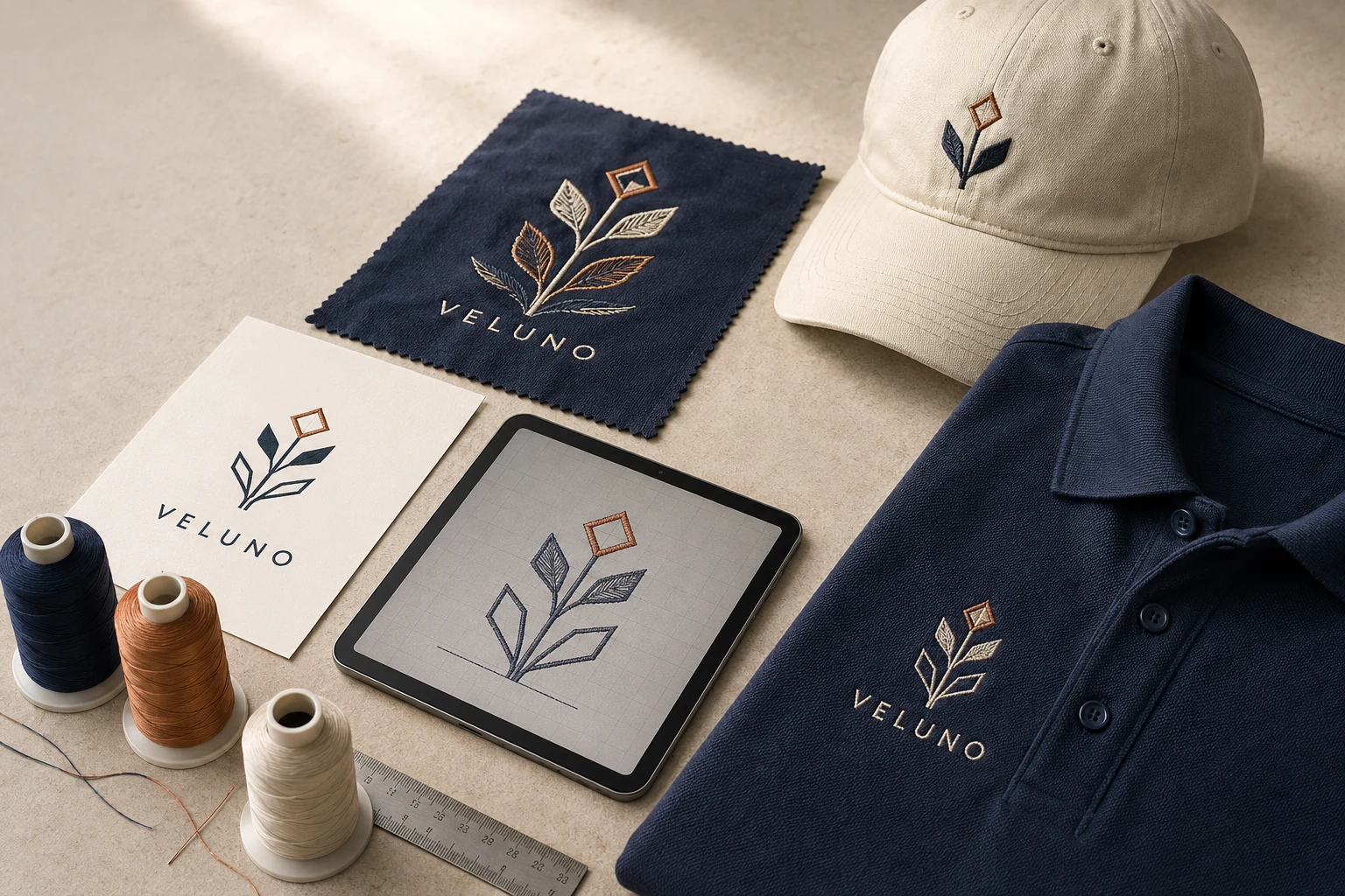
Cover image: AI-generated editorial concept; not a customer project or production proof.
To digitize a logo successfully for embroidery, start with clear artwork, simplify details at the intended size, adapt lettering to the fabric, plan colors realistically and digitize for the actual placement. Then test the design on the intended material before approving production.
These five tips help you judge the decisions that turn a recognizable logo into readable embroidery on polos, workwear, caps, jackets and bags.
1. Start with clear artwork at the intended size
Provide the clearest original logo available, with identifiable outlines, letter shapes and color areas. Ask for the original artwork when a screenshot or small image leaves details uncertain. Avoid asking a digitizer to guess at a blurred tagline or symbol.
Vector artwork can be useful, but it is not a prerequisite for every workflow. Embroidery software can work from both bitmap and vector artwork; digitizing creates the embroidery objects and stitches from those shapes. A vector file alone is not a finished embroidery file. Hatch’s explanation of artwork conversion describes that distinction.
View or print the logo at its proposed stitched dimensions before deciding which details to preserve. Enlarging the artwork on screen helps inspect shapes, but it does not show how readable the finished logo will be on a garment.
For automated conversion, follow the software’s artwork preparation guidance. For example, Hatch’s image preparation instructions recommend specific PNG settings for its auto-digitizing workflow. Those settings are workflow guidance, not a universal requirement for every digitizer.
2. Simplify details while protecting the logo’s identity
Before creating stitches, agree on what must remain recognizable: the main symbol, business name, distinctive proportions and essential colors. Then review secondary details at the intended embroidery size.
Useful changes to discuss include:
Removing a tiny tagline from a compact version.
Reducing multiple outlines to one clear border.
Enlarging small lettering or opening tight spaces.
Simplifying decorative lines that are difficult to distinguish at actual size.
Get the logo owner’s approval before changing wording, proportions, letter case or colors. An embroidery adaptation should be an agreed version of the logo.
Letter shape matters as well as size. Wilcom advises avoiding tight curves, sharp corners and very fine serifs when creating embroidery lettering. Use that guidance to identify fragile details for review, rather than automatically making every letter bold or uppercase. Wilcom’s custom font considerations explain these shape constraints.
3. Match small lettering to the fabric
Tell the digitizer what the logo will be stitched on. “Cotton” alone is incomplete: specify whether it is a woven shirt, jersey T-shirt, piqué polo or another construction, and provide the garment model when available.
Do not assume a lettering setup approved on one fabric will work unchanged on another. Wilcom identifies density, underlay and pull compensation as settings that need to suit the fabric. Underlay is the supporting stitching beneath the visible stitches; pull compensation adjusts shapes to account for distortion during sewing. Wilcom’s fabric-specific lettering guidance supports using different setups for different materials.
For small text, ask for a sample that shows whether letters remain distinct and internal spaces stay open. If the wording is difficult to read, discuss increasing its size, adjusting spacing or approving a simpler lettering treatment.
Avoid treating a single minimum letter height as a guarantee. A useful approval question is: “Can this exact wording be read clearly at this size on this garment?”
4. Plan detail and color blending around the available space
A larger placement gives you more room to consider decorative detail, but size alone does not establish whether a particular effect will stitch well. Review the smallest version first when the same logo is intended for several products.
For a compact logo, consider proposing solid color areas in place of subtle gradients. Preserve the main color relationships and compare the simplified version with the original before approval.
Thread blending is possible, but it requires stitch planning. Hatch’s color blending example uses blend profiles and adjustable stitch spacing, and its author reports testing several sew-outs while refining the result. A smooth digital gradient therefore needs a stitched evaluation of its own. Hatch’s color blending tutorial illustrates the process.
Ask the embroiderer to identify the proposed thread colors and review a physical sample when color appearance is important. Record the approved choices with the design so repeat orders have a clear reference.
5. Digitize for the actual placement, then test
Confirm both width and height before work begins. For US, Canadian and UK suppliers, label units clearly; for example, 3 inches equals 76.2 mm. State whether a measurement refers to the complete logo or just its main symbol.
Placement | What to confirm |
|---|---|
Left chest | Final dimensions on the selected garment, with enough room for readable lettering. |
Cap front | Cap profile, center seam, usable sewing area and cap-specific stitch sequence. |
Jacket or bag | Available flat area, seams, pockets and access for hooping. |
Multiple products | Which sizes and fabrics need separate files or sew-outs. |
A cap version needs particular attention. Melco explains that usable design height depends on the cap’s profile, while width depends on the frame. It also recommends sewing from the bill toward the crown and from the center toward the sides. This makes a fixed 2.5-inch cap limit an unreliable rule for every cap. Melco’s cap digitizing guidance covers both sizing and sequence.
Before production, request a sew-out using the intended garment or representative material and the planned production setup. Review lettering, borders, gaps, color appearance and fabric distortion. Record any revisions and test the revised design when they affect the result. A screen preview is useful for discussing layout; the sewn sample is the practical approval reference.
If you are commissioning the work, send the artwork, final dimensions, garment details, placement and machine file requirements together. DigitEMB’s logo embroidery digitizing service is the relevant service page for a logo project.
FAQs
Does my logo have to be vector artwork?
No. Supported bitmap artwork can also be used for digitizing. Supply the clearest original available and confirm the digitizer’s preferred format. Both types still need to be translated into stitches.
Should I remove small text from my logo?
Only when the approved design and sample justify it. First consider a larger size, adjusted spacing or simpler lettering. Obtain approval before removing a tagline or changing the business name’s appearance.
Can the same logo file be used on a polo and a cap?
Have the digitizer review it first. Different fabrics may need different stitch settings, and caps introduce placement and sewing-sequence constraints. Approve a sample for each intended application.
Practical details for 5 Logo Digitizing Tips for Cleaner Embroidery Results
Use the article above as a starting point, then make the production brief specific to your own design. A stitch file is made for a finished size and material, so the artwork alone is only part of the instruction.
Work through these points in order and keep the answers with the artwork or production request. A short written brief makes it easier to compare a proof with the intended result, ask a useful follow-up question and avoid relying on assumptions made from a screen image alone.
The aim is not to add unnecessary steps. It is to identify the choices that change the final result before work begins. If a requirement is unknown, flag it for confirmation rather than guessing; that keeps the approval process focused on the design, material and use that apply to this particular project. Save the approved brief with the project files for future reorders or revisions.
Confirm the finished use
State the item, placement and finished width and height. A chest logo, cap front and jacket back do not use the same sewing area, even when they start from the same artwork.
Protect the smallest details
Review small lettering, narrow gaps, thin outlines and tiny colour changes at the final size. Simplifying a fragile detail before digitizing is often more reliable than trying to force it into a small sew-out.
Match the file to the machine
Tell the production team the embroidery machine or format required, along with the fabric or garment type. This lets them prepare the right export and make choices that suit the material rather than treating every job alike.
Quick questions to check before you proceed
What should I send with my artwork?
Send the clearest original available, the finished dimensions, placement, fabric or garment type and the required machine format if you know it.
Can the same file be used at every size?
Not always. Scaling changes the relationship between stitch length, detail and fabric, so a design may need review when the finished size or placement changes.
What should I check before production?
Confirm the spelling, colours, final size, placement and any details that must remain readable. A proof or sample is the best point to catch a change.