
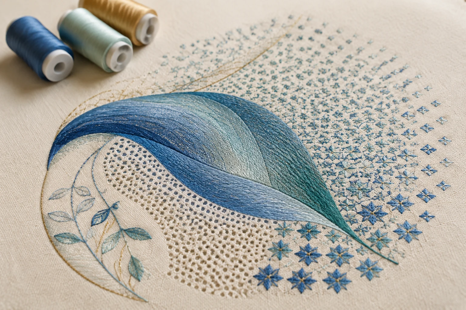
Cover image: AI-generated editorial concept; not a customer project or production proof.
Color blending in embroidery digitizing creates gradual color transitions by overlapping thread layers with controlled stitch spacing. Accordion spacing changes coverage within a layer; combining graduated layers introduces additional colors. Curved fills and motifs add movement and texture alongside those blends. Wilcom’s Color Blending explanation describes how graduated spacing and travel-run control work together.
For buyers, the useful question is how the effect will look at the finished size on the chosen fabric. A screen preview is a starting point; request a physical stitched sample before approving production.
Choose the effect for the design
The original article’s tool names come from Wilcom EmbroideryStudio. Treat the instructions below as software-specific examples, since menus and available features vary by edition.
Desired appearance | Technique to consider |
|---|---|
A fade from dense stitching to exposed fabric | Accordion spacing |
A transition between thread colors | Layered color blending |
Flowing lines within a shape | Florentine or Liquid effects |
Stitching that follows a shape’s contours | Contour fill |
An open, meandering texture | Stipple fill |
A repeated decorative pattern | Motif fill or motif run |
A crossed-stitch texture | Cross-stitch fill |
These belong to related families of decorative stitching, but each serves a different purpose. A texture fill does not automatically produce a color gradient. Wilcom organizes these capabilities under decorative embroidery.
Create shading with accordion spacing
Accordion spacing varies the distance between stitch rows, moving from close coverage to a more open fill. Wilcom recommends it particularly for tatami. It overrides Auto Spacing and Fractional Spacing while retaining other settings, including stitch angle.
To apply it in EmbroideryStudio:
Select a suitable filled object, such as a tatami Complex Fill.
Apply Accordion Spacing and open its properties.
Choose a profile that places dense and open areas where the shading requires them.
Adjust spacing values and inspect the transition.
Use Reshape if the gradient angle needs adjustment.
Recent versions also support custom profile graphs. Follow the controls documented for your edition rather than assuming every version has the same presets. See Wilcom’s accordion fill instructions.
As a practical exercise, test one color fading across a simple rectangle before adding a second layer. This makes it easier to judge the spacing profile without also evaluating a color transition.
Blend two or more thread colors
Using the earlier Color Blending tool
In versions with the older Color Blending tool, select a supported object, open the blend settings, and assign the bottom and top layers their colors, spacing and profiles. Pair profiles so one layer becomes more open as the other becomes denser.
The resulting objects are grouped. Ungroup them when you need to edit an individual layer’s accordion settings. Wilcom also advises applying curved-fill effects to the original object before generating this blend. See its legacy Color Blending workflow.
Using Multi Blend in Designing 2026
Wilcom states that Multi Blend supersedes Color Blend in EmbroideryStudio Designing 2026. It can combine multiple colors, stitch types and effects within one editable object. This means the older two-color workflow is not a universal limit on embroidery blending. See Wilcom’s Multi Blend overview.
To begin, open Docker > Multi Blend, select a suitable object and apply a profile. Use the Layers panel to adjust individual layers, change their order or add and remove layers. Save a successful combination as a reusable profile. Wilcom’s stitch-layering guide documents these controls.
For a first sample, try two related shades and a simple shape. Once the transition is satisfactory, evaluate stronger color contrasts or additional layers. Keep a separate copy of each test so you can compare results.
Keep open fills clear of unwanted stitches
Open shading needs deliberate travel-run and underlay choices. Wilcom’s Trapunto effect routes underlying travel runs toward an object’s edges to reduce their visibility through open stitching. In this context, Trapunto is a routing control rather than a color-blending method by itself. See Wilcom’s Color Blending and Trapunto explanation.
Underlay needs a separate decision. Wilcom’s layering guidance recommends leaving Auto Underlay off unless it is needed for structure. Inspect the open areas and test the fabric support; avoid applying a blanket rule to every garment. See the stitch-layering usage tips.
Add movement with curved fills
Florentine, Liquid and Contour effects shape the direction of stitching. They can complement shading without requiring a new thread color.
Florentine: stitches follow a single digitized guideline.
Liquid: stitching transitions between two guidelines.
Contour: stitching follows the object’s shape to create a contoured appearance.
Wilcom explains these distinctions in its curved fills guide.
Create a Florentine fill
Choose a suitable closed shape and stitch type, then apply Florentine Effect. Follow the prompts for the boundaries and entry and exit points. Draw a guideline crossing both sides of the object with at least three points, and avoid a guideline that crosses itself. Use Reshape to refine it.
Florentine overrides existing stitch angles. Wilcom suggests smooth curves and relatively short stitches—for example, 4 mm or less—and advises turning off auto-splits when using satin in this workflow. Treat these as software guidance to evaluate in a sample, rather than a universal production recipe. See the Florentine instructions.
Build texture with stipple and cross-stitch fills
Stipple fill uses meandering run stitching within a boundary. Its controls include stitch length and loop spacing, making it useful when the desired appearance is an open, irregular texture.
Cross-stitch fill creates a crossed-stitch pattern with controls for size or count and orientation. Use it when that texture suits the artwork; check the generated stitch count before assuming it will reduce production work.
Both are alternatives worth sampling alongside conventional fills. Wilcom America describes them in its shading and open fills overview.
Use motifs for pattern and dimensional effects
Motif fills repeat small designs in rows across a closed shape. They can remain open or sit over a stitched background. Their primary contribution is a repeated pattern; a smooth color transition requires additional color and layering decisions. See Wilcom’s motif fill documentation.
Adjust motif size, row and column spacing, offsets and pattern rotation. In Wilcom, the motif pattern’s rotation controls its orientation rather than the original fill’s stitch angle. Check boundary clipping and overlaps after changing the layout. See motif fill settings.
Custom motifs let you save and reuse patterns, while motif runs place decorative repeats along a path. These are covered in Wilcom’s decorative embroidery documentation.
For an apparent curved surface, 3D Warp changes motif size and spacing to suggest concave or convex forms. This is a visual shaping effect; specify raised embroidery separately if physical height is the goal. See Wilcom’s 3D motif effects.
Brief the digitizer and review the sample
For a project in the US, Canada or UK, provide the finished dimensions with units clearly marked. Include the garment or fabric, its color, placement, machine requirements and any preferred thread references. Describe which parts should blend smoothly and which should retain visible texture.
Ask for a sample using the intended fabric, thread and stabilizer combination. Review it at normal viewing distance and close up:
Does the gradient follow the artwork’s intended direction?
Are there abrupt bands, unwanted gaps or visible travel lines?
Do curved fills and motifs remain clear at the final size?
Does the fabric lie flat, and does the embroidered area feel suitable for the garment?
If the sample disappoints, ask the digitizer to review the relevant layers, spacing, routing or motif scale before approving another test. Keep the final dimensions fixed during that comparison.
You can use DigitEMB’s embroidery digitizing service page to discuss the artwork and its intended stitched appearance. Include the details above so the request describes a measurable result.
Frequently asked questions
Can embroidery reproduce an artwork gradient exactly?
Treat the artwork as a visual reference and approve the result in thread. Ask for a sew-out at the intended size to decide whether the transition meets your needs.
Does color blending require more than two colors?
No. Two colors are a useful starting point. Additional layers are an option in tools such as Wilcom Multi Blend, but the design should determine whether they are needed.
Are motif fills and curved fills color-blending techniques?
They are related decorative effects. Motifs create repeated patterns, and curved fills direct stitching through a shape. Combine them with graduated spacing and color layers when the artwork calls for both texture and shading.
Should I disable all underlay for a gradient?
Evaluate the open areas and the garment’s support needs. Wilcom recommends avoiding unnecessary Auto Underlay in layered open stitching while allowing it when structure requires it. See its layering guidance.
Practical details for Color Blending Techniques in Embroidery Digitizing
Use the article above as a starting point, then make the production brief specific to your own design. A stitch file is made for a finished size and material, so the artwork alone is only part of the instruction.
Work through these points in order and keep the answers with the artwork or production request. A short written brief makes it easier to compare a proof with the intended result, ask a useful follow-up question and avoid relying on assumptions made from a screen image alone.
The aim is not to add unnecessary steps. It is to identify the choices that change the final result before work begins. If a requirement is unknown, flag it for confirmation rather than guessing; that keeps the approval process focused on the design, material and use that apply to this particular project. Save the approved brief with the project files for future reorders or revisions.
Confirm the finished use
State the item, placement and finished width and height. A chest logo, cap front and jacket back do not use the same sewing area, even when they start from the same artwork.
Protect the smallest details
Review small lettering, narrow gaps, thin outlines and tiny colour changes at the final size. Simplifying a fragile detail before digitizing is often more reliable than trying to force it into a small sew-out.
Match the file to the machine
Tell the production team the embroidery machine or format required, along with the fabric or garment type. This lets them prepare the right export and make choices that suit the material rather than treating every job alike.
Quick questions to check before you proceed
What should I send with my artwork?
Send the clearest original available, the finished dimensions, placement, fabric or garment type and the required machine format if you know it.
Can the same file be used at every size?
Not always. Scaling changes the relationship between stitch length, detail and fabric, so a design may need review when the finished size or placement changes.
What should I check before production?
Confirm the spelling, colours, final size, placement and any details that must remain readable. A proof or sample is the best point to catch a change.